- New industry level course for design professionals coming soon
- Design
- Inspire
- About
- About
- Blog
- Deconstructing 08-Sparks in the kitchen

- May 23, 2021
- Monica Duggan
This week is a little different to the last few weeks as I’m not leaving my kitchen….just yet. See, I told you I love this space!
Kitchen lighting is such a difficult area for people to get their heads around so thought I would focus there this week while the kitchen is still fresh in your minds.
With our kitchen, there were a few elements we had to consider when it came to the lighting. Firstly, being a cottage we have low ceilings. Secondly, this was a retrofit so given it used to be our sitting room there are three access points into the space, including our stairs and a fireplace.
It can be hard to know where to start with a space like this so I started where we most needed light at the kitchen units and worked everything else off that.
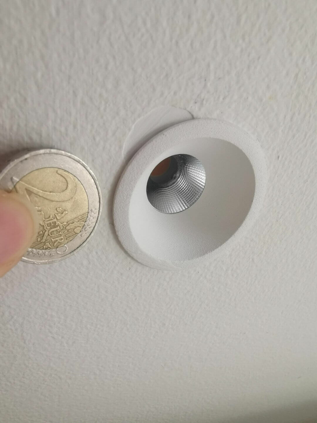
Given that we had very little height in the ceiling, we had no ability to add any hidden lighting details here. Also, I was very conscious of the narrow width of the working kitchen space and so didn’t want to overpower the area with imposing downlights, whatever I used had to be as subtle as possible. So I chose 4 tiny spots, each 45mm in diameter which give great light with minimal impact. Their positioning was fundamental so we brought them as close as possible to the kitchen units to ensure there’s no shadow when working in that area.

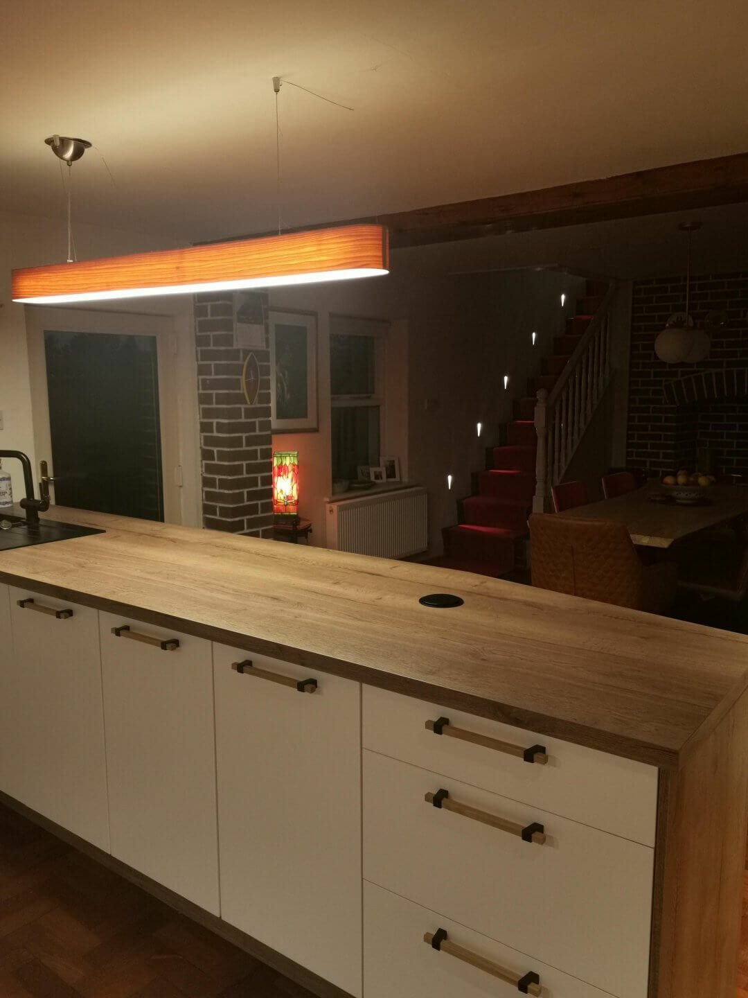
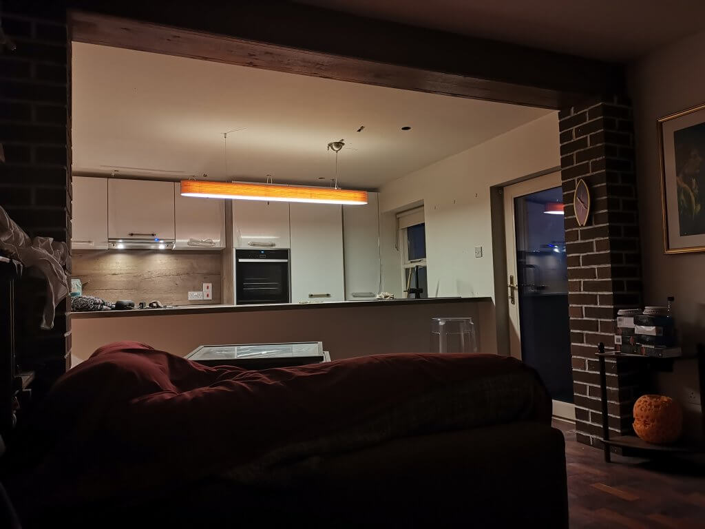
They really are tiny! Then over our island, our second work space, we kept it simple with an LZF wood veneer liner pendant in the same colour tone as the wood on our counter (it took a while to get this right, many nights I played with samples). This piece is great for atmosphere, it really warms the space and looks great at night but most importantly gives enough light to work comfortably on this surface at anytime.

Excuse my photo skills the linear pendant looks way better than this but you can get the idea! (the tiffany snuck into the shot!) Once I had this area sorted I moved onto the rest of the space.
This was difficult as we didn’t chase these walls and so had to work around the wire points and switches we currently had. It took a bit of thought as I was adamant I was getting this right but had to ensure what I envisioned was possible to do.
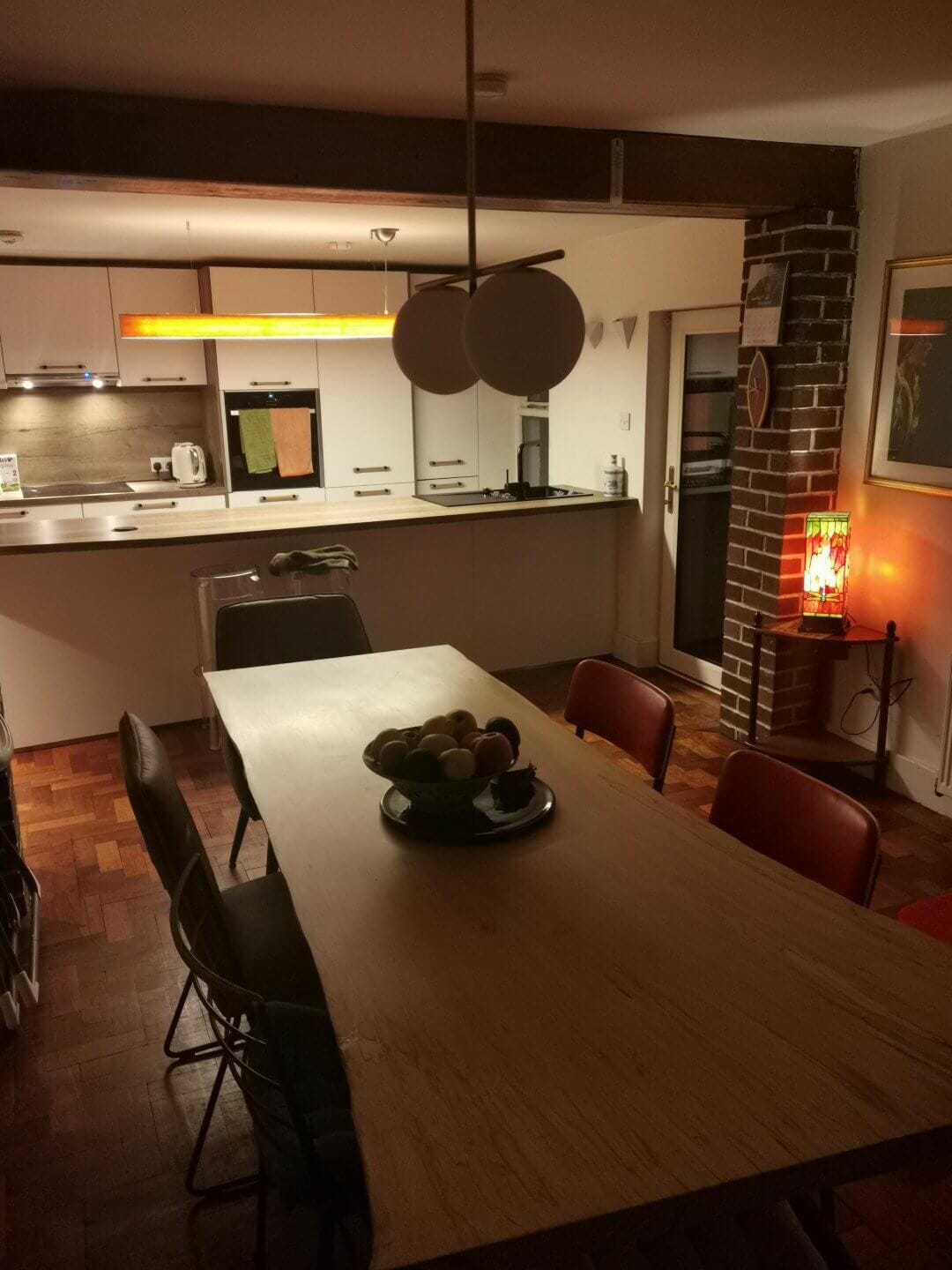
The kitchen table would always be our focal point, and so lighting wise I needed to treat it like one. I had initial thought of doing a linear cluster of lights here but with our low ceilings felt it would ultimately clutter the space so I went back to a single pendant with two lamps – keeping it simple but with lots of light. In order to do this though, we had to feed cable from one of our existing downlights to the ceiling light position. Not an easy job as any electrician will tell you! But it can always be done, NO never sits well with me 😉. We did also keep the existing downlights, there were only two to be fair and we rarely use them but they are great for cleaning etc.
Our kitchen table sits in front of the old brick fireplace, which we also wanted to make a feature out of, light and texture always work well together, so I used some hidden lighting detail here….finally got to squeeze some in! After a late dinner we’ll often sit with just this light on, it works great for atmosphere, people tend to feel more relaxed the less light used in the evening and you can really get them talking 😉

Clever switching allows lots of different scene settings! We kept to low-level lighting on the staircase which runs up along the wall across from the table, this light gives a beautiful effect as it comes through the balustrade at night and we’ll often use it in combination with the fireplace hidden detail, and a small tiffany lamp I added on a 5 amp socket between the kitchen and dining area, meaning most evenings it’s hard to get people to leave the table at all and we’ve had many a hefty debate here!
All of these lights in our kitchen are switched separately making it easy to creates scenes such as above. Switching is really important for everything in lighting and is a much bigger topic so I’ll keep that for a future newsletter.
Even though my kitchen was probably the most difficult room in the house from a functional and design perspective, it is the one I’m most proud of. Even the retro fitting didn’t get in the way of what we wanted to achieve – but I have to say I do like a challenge.

About Monica Duggan
Monica grew up with a screwdriver & bulb in her hands before she started to 'hassle' the boss! After gallivanting around the world & getting an education she worked in all areas of the business, and was a natural fit for developing Willie Duggan further. She does her best thinking struggling up a mountain, hiking a trail or beating herself up in the gym!
Browse by category
Keep reading


- Inspire
