- Contact us to discuss our residential design packages
- Shop
- Design
- Inspire
- About
- About
- Blog
- A Note on Blue

- February 1, 2019
- Willie Duggan
In her book ‘The Secret Lives of Colour’ the author Kasia St Clair expands upon the social roots, cultural understanding and history of a range of colours. Blue, being one of my favourite colours, gets special treatment; first listing the shades of the colour, she then uses a range of evocative descriptors to alert us to the wonder of this colour; Ultramarine, Cobalt, Indigo, Prussian Blue, Egyptian Blue, Woad, Electric Blue, Cerulean. Blue for me means Miro, Van Gogh, Wedgwood, The Blues, Midnight skies, delftware patterns, forget me not. It’s the colour of the virgin Mary, of worry but also of blue skies and sunshine. No other colour has such a diverse and interesting array of styles. Where would we be without indigo? What would fashion look like without indigo blue jeans dyed with colour made from the indigofera tinctoria plant? What about blue suits? Crisp blue shirts?
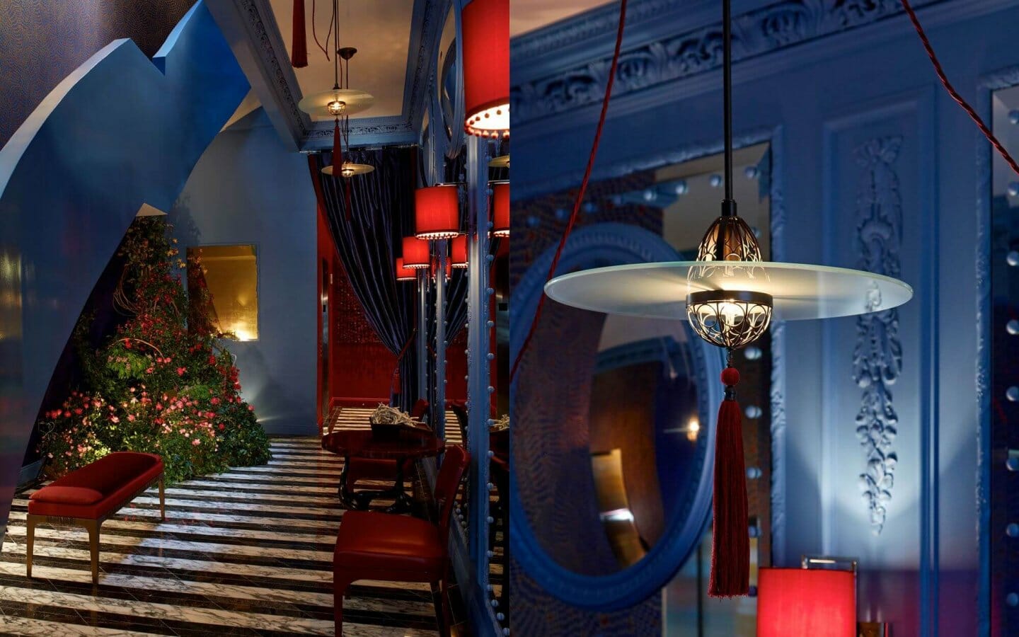
In interior design blue is one of the most misunderstood and under – utilised colours. A pity, it offers a range of moods and boldness that is unsurpassed by any other colour. For a classical interior panelling can be painted dark Indigo and a jolt of life injected by picking out the detail in grey. To lift a dark blue wall into a fantastic vignette you can add pops of yellow or orange, for French style chic you can use forget me not blue with clotted creams and ivory. If you want a contemporary look you can try a 1950’s blue for a modern take, combine it with a punchy orange and you have a modernist masterpiece.

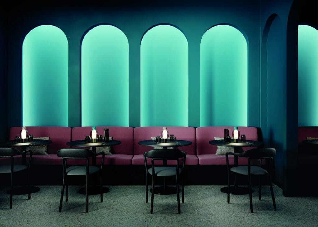
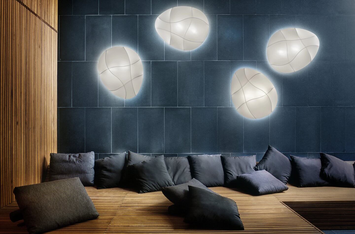
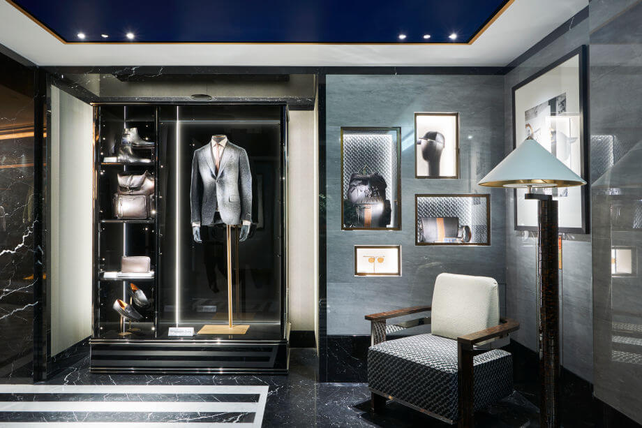
Which brings us to lighting; the biggest complaint we hear is that blue is ‘cold’ or ‘oppressive’. This is where lighting can be the hero to make blue come alive. With pale blues you can use warmer lights to provide a wash of cosiness, if you want to preserve the iciness of blue in a hallway perhaps you can use a whiter light temperature thus keeping it crisp. For a darker blue you can accessorise with equally dark lights and inject some brass, gold leaf or chrome to the mix – the result? A contemporary and classic interior that is slow to date and is bold and beautiful.
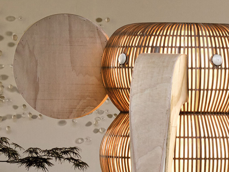
Even based on the above its interesting to note that when I work with clients on a new building or a renovation of an existing space blue is always a difficult sell. Blue light fittings, especially in glass can look very bright especially if up against a white or bright background. The darker fittings offer more potential; the chance to make a big impression. Dark panels of colour or even a primary yellow or orange always look better with high contrast blue. For most impact choose blues from opposite ends of the colour scale, sticking to three shades maximum. The more contrast, the higher the drama.

For customers who are updating residential projects its definitely a colour that should be considered as many of these spaces offer small areas where high impact can really work. For professional customers commercial spaces also offer potential to play particularly with light fittings and hospitality areas probably offer the most potential for creation of intriguing spaces.
At the most recent Maison et Objet fair in Paris all the focus was on spring pastels and dusty pinks, what was interesting to see was that blue, in all its variants was present too offering buyers a chance to build a more classic portfolio that would also work with sugar pink, egg yolk yellow and Mandarin.
Next time you consider a project, consider blue; drama, dreaminess, classic lines and a depth of shades that is unsurpassed by other colours – blue is the winner for those brave enough to try.
- Design
- Blue, Colour, Creativity, Design, Light Design, LZF

About Willie Duggan
Willie grew up in the family business, stacking boxes, wiring fittings and making deliveries. He went on to study engineering and then lighting design. After working as a lighting designer in London he returned to lead our design team. You can also find Willie chasing a ball round the rugby pitch, at a gig or threading the boards on stage.
Browse by category
Browse by tag
- #IDSW2019
- 2019
- 2021
- 2022 Award Winners
- 48 volt track
- About Us
- Ambient Lighting
- Architect
- Art
- Arturo Alvarez
- Awards
- Bathrom
- Bathroom
- Bathroom Design
- Bathroom Lighting
- Baynetcap
- bedroom lighting
- Behind the Scenes
- Biophilia
- Biophilic Design
- Blanchardstown Shopping Centre
- Blog Post
- Blue
- Brands
- building materials
- bulbs
- Carton House
- church design
- Colour
- Comfort Lighting
- commercial
- commercial design
- Contract Interiors
- cost
- Cottage Design
- Creativity
- Deconstructing
- decorative lighting
- Denise O'Connor
- Design
- Design Team
- Details
- Dining Space Lighting
- Downlighting
- downlights
- E14
- electrician
- Electrics
- Emotion
- Emotional Lighting
- enviromentally friendly
- Estluz Laverd
- Exhibitions
- Experience
- experiential showroom
- Exterior Lighting
- external lighting
- eyelit65R
- Festoon Lighting
- Finalists
- Finances
- first fix
- five star hotel
- floor lamp
- Floor Light
- Floor Plan
- flooring
- functional lighting
- Garden
- Garden Lighting
- Getting the lighting right
- Glare
- GU10
- guide
- Haberdashery
- Hard Wood Flooring
- healthy lighting
- Heart of the home
- hidden lighting
- hints
- Home
- Home renovation
- house design
- Hypro
- Illuminated Furniture
- IMNDA
- importance of windows
- inchsawmills
- Interior Design
- Interior Lighting Design
- Interiors Trends
- International Dark Sky Week 2019
- internorm
- IP Rating
- Irish Times
- Ivela
- Jan Battles
- kitchen
- Kitchen Design
- Kitchen lighting
- Kitchen Squeeze
- Lampshades
- Landscape Lighting
- Layers of Light
- LED
- LEED
- Light
- light and health
- Light Art
- Light Brands
- Light Design
- Light Effects
- Light Fitting
- light masterplanning
- Light Pollution
- Light Technology
- lightbulbs
- Lighting
- Lighting Company
- lighting controls
- Lighting Design
- lighting designer
- Lighting Designers
- Lighting Plan
- Lighting Products
- lighting switches
- lighting tips
- LIT awards
- Living Space Lighting
- LND
- LZF
- Minimal Glare
- Monica Duggan
- mood lighting
- Motor Neurone Ireland
- munster joinery
- Nest
- new build
- New Year
- new york
- newbuild
- Newsletter
- night time lighting
- NYCxDESIGN
- Online Consultation
- Open Plan Space
- Our Team
- Outdoor
- Outdoor Lighting
- Parquet FLooring
- pendant light
- Pendants
- Piet Oudolf
- plastering
- plumbing
- Power of Switching
- Prolicht
- recessed lighting
- reducer
- reflections
- renovate
- Renovation
- Residential Lighting
- Residential lighting design
- retail
- Retro Fit
- riai
- salvaging
- scene setting
- Self build
- Self Build Newsletter
- selfbuild
- senator
- shadows
- sonos
- spacer
- Spotlights
- st bartholomews church
- Studio Italia
- sustainable
- sustainable building
- switching
- table lamp
- Table Light
- talalighting
- Task Lighting
- The Irish Times
- timber frame
- tips
- Trend
- tricks
- UGR
- Unified Glare Rating
- voliere
- willie duggan
- willieduggan
- Windows
- wiring


- Inspire
