- Contact us to discuss our residential design packages
- Shop
- Design
- Inspire
- About
- About
- Blog
- A quick talk through St. Bartholomews Church design…

- February 9, 2021
- Kate Nelligan
The Architect Howley Hayes brought us on board this project at the beginning of 2017. We worked closely with them to understand the history of the church and what the client wanted to achieve.
In the short video above Willie talks us through the concept which we’ve outlined below.
The brief was simple – to ensure people felt welcome in the church and to highlight the existing architecture but we also took our time to understand how the vicar, choir, and parishioners used the space.
So firstly we looked at highlighting the ceiling which was made up of dark wood beams that criss crossed the church. Behind these beams we discovered beautiful red and green painted “stripes”. We used projector fittings at either side of the church and angled these across each other to highlight the paintwork. We combined this with a narrow beam project at the base to highlight the height of the ceiling.
Projector fittings were used to also pick up the “seating area” this was a key factor for the client so the parishioners could comfortably read in the space.
We used lower-level lighting at both transepts. These were to be used for smaller sermons therefore needed more functional so they didn’t take from the main body of the church.
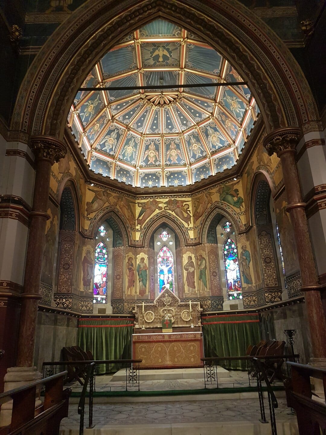
The altar area of the church was our main feature. It’s stunning architecture and murals just needed subtle hidden lighting to bring it alive. To create this we used a mixture of LED strip lighting and projector fittings to uplift the gold dome – it was was tricky. We needed to work out the right direction and outputs to ensure an even spread of light.
We’re very proud of this project turned out, it was also shortlisted for an RIAI award which was an added bonus.
Let us know what you think!
- Design
- church design, Lighting Design, riai, st bartholomews church, willie duggan

About Kate Nelligan
Kate is your typical design junkie who loves all things marble and brass. She works closely with our clients developing relationships, which allows her to make as many brunch meetings as possible. If not found running around Dublin she'll be back in Kilkenny collecting her online clothing parcels.
Browse by category
Browse by tag
- #IDSW2019
- 2019
- 2021
- 2022 Award Winners
- 48 volt track
- About Us
- Ambient Lighting
- Architect
- Art
- Arturo Alvarez
- Awards
- Bathrom
- Bathroom
- Bathroom Design
- Bathroom Lighting
- Baynetcap
- bedroom lighting
- Behind the Scenes
- Biophilia
- Biophilic Design
- Blanchardstown Shopping Centre
- Blog Post
- Blue
- Brands
- building materials
- bulbs
- Carton House
- church design
- Colour
- Comfort Lighting
- commercial
- commercial design
- Contract Interiors
- cost
- Cottage Design
- Creativity
- Deconstructing
- decorative lighting
- Denise O'Connor
- Design
- Design Team
- Details
- Dining Space Lighting
- Downlighting
- downlights
- E14
- electrician
- Electrics
- Emotion
- Emotional Lighting
- enviromentally friendly
- Estluz Laverd
- Exhibitions
- Experience
- experiential showroom
- Exterior Lighting
- external lighting
- eyelit65R
- Festoon Lighting
- Finalists
- Finances
- first fix
- five star hotel
- floor lamp
- Floor Light
- Floor Plan
- flooring
- functional lighting
- Garden
- Garden Lighting
- Getting the lighting right
- Glare
- GU10
- guide
- Haberdashery
- Hard Wood Flooring
- healthy lighting
- Heart of the home
- hidden lighting
- hints
- Home
- Home renovation
- house design
- Hypro
- Illuminated Furniture
- IMNDA
- importance of windows
- inchsawmills
- Interior Design
- Interior Lighting Design
- Interiors Trends
- International Dark Sky Week 2019
- internorm
- IP Rating
- Irish Times
- Ivela
- Jan Battles
- kitchen
- Kitchen Design
- Kitchen lighting
- Kitchen Squeeze
- Lampshades
- Landscape Lighting
- Layers of Light
- LED
- LEED
- Light
- light and health
- Light Art
- Light Brands
- Light Design
- Light Effects
- Light Fitting
- light masterplanning
- Light Pollution
- Light Technology
- lightbulbs
- Lighting
- Lighting Company
- lighting controls
- Lighting Design
- lighting designer
- Lighting Designers
- Lighting Plan
- Lighting Products
- lighting switches
- lighting tips
- LIT awards
- Living Space Lighting
- LND
- LZF
- Minimal Glare
- Monica Duggan
- mood lighting
- Motor Neurone Ireland
- munster joinery
- Nest
- new build
- New Year
- new york
- newbuild
- Newsletter
- night time lighting
- NYCxDESIGN
- Online Consultation
- Open Plan Space
- Our Team
- Outdoor
- Outdoor Lighting
- Parquet FLooring
- pendant light
- Pendants
- Piet Oudolf
- plastering
- plumbing
- Power of Switching
- Prolicht
- recessed lighting
- reducer
- reflections
- renovate
- Renovation
- Residential Lighting
- Residential lighting design
- retail
- Retro Fit
- riai
- salvaging
- scene setting
- Self build
- Self Build Newsletter
- selfbuild
- senator
- shadows
- sonos
- spacer
- Spotlights
- st bartholomews church
- Studio Italia
- sustainable
- sustainable building
- switching
- table lamp
- Table Light
- talalighting
- Task Lighting
- The Irish Times
- timber frame
- tips
- Trend
- tricks
- UGR
- Unified Glare Rating
- voliere
- willie duggan
- willieduggan
- Windows
- wiring


- Inspire
