- Contact us to discuss our residential design packages
- Shop
- Design
- Inspire
- About
- About
- Blog
- Paint with Light

- May 9, 2019
- Willie Duggan
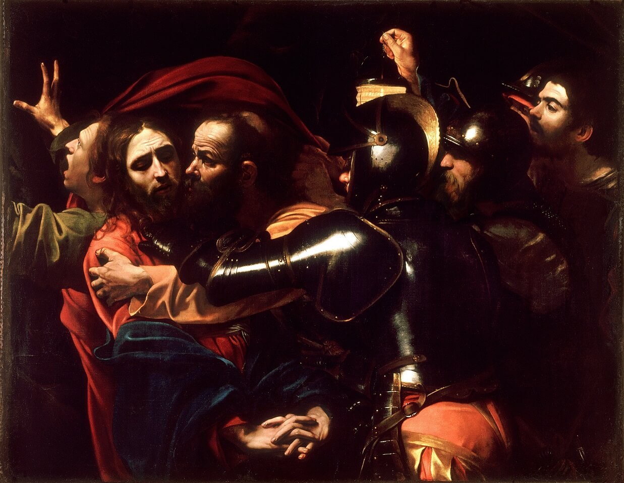
I remember reading about Caravaggio in my art books when we looked at the great masters and then seeing his The Taking of Christ in our National Gallery. Although the painting and likeness of the subjects was amazing it was the contrast between the dark and the light that struck me the most. We can’t fully see the faces of any of the subjects or their clothes. Jesus’ face in resigned to his fate eyes downcast and mournful, his hands locked in prayer. Around him a flurry of activity; the guards coming to arrest him and the soft treacherous kiss of Judas. This is all we need to see to understand the story, we don’t need to see every detail. He used Chiaroscuro contrasting light and dark to create his dramatic emotive images. It’s arresting and memorable. It’s a theme he used over and over in his paintings, exploring the play with light on his subjects. Some even say that Caravaggio’s paintings were the precursor to modern art.

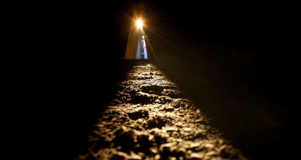
I’m drawn to the contrast between light and dark. When I capture a fleeting moment on my camera or when I set up to paint. Highlights of light draws your eye but it’s the surrounding darkness that frames it. Our natural source of light; the sun creates a moving shadow across the day which is taken over by the moon at night. This can be obscured by clouds on any given day or night that diffuses this light and softens the contrast. Ancient Irish people built monuments to capture the exact point the light hit a point in the day and a day of the year. Newgrange was built in 3200 BC as a passage tomb during the Neolithic period. The light box captures the light and illuminates the tomb on the 21st of December every year. It seems as we are creatures of the light and have worshiped it from the beginning of man.

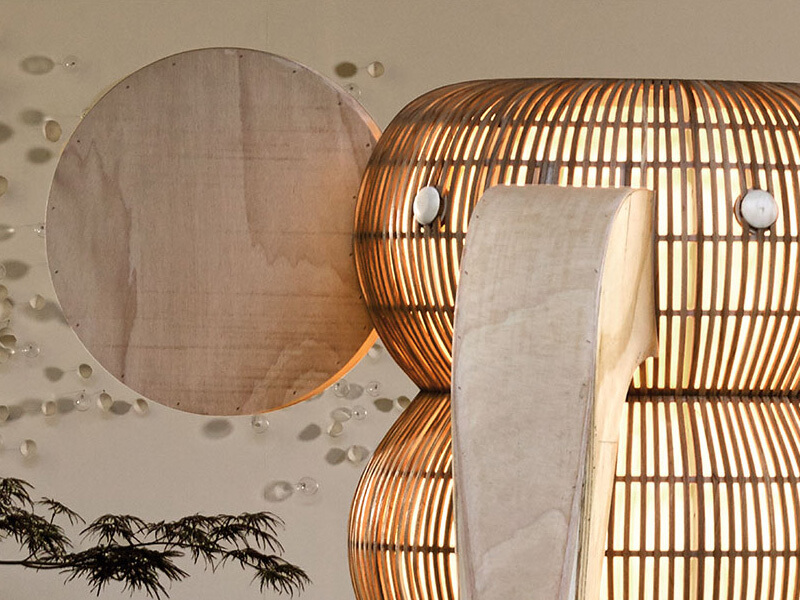
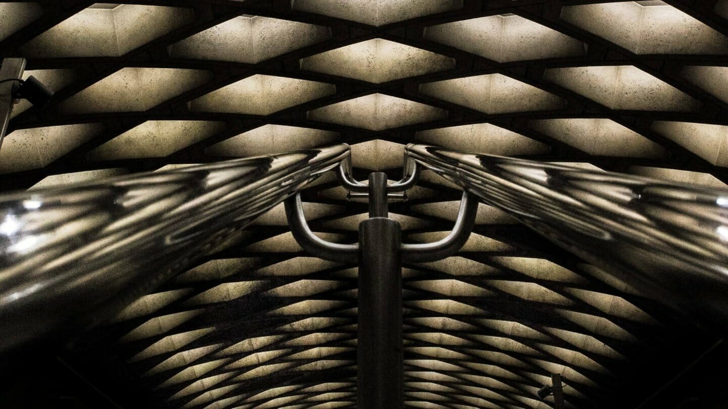
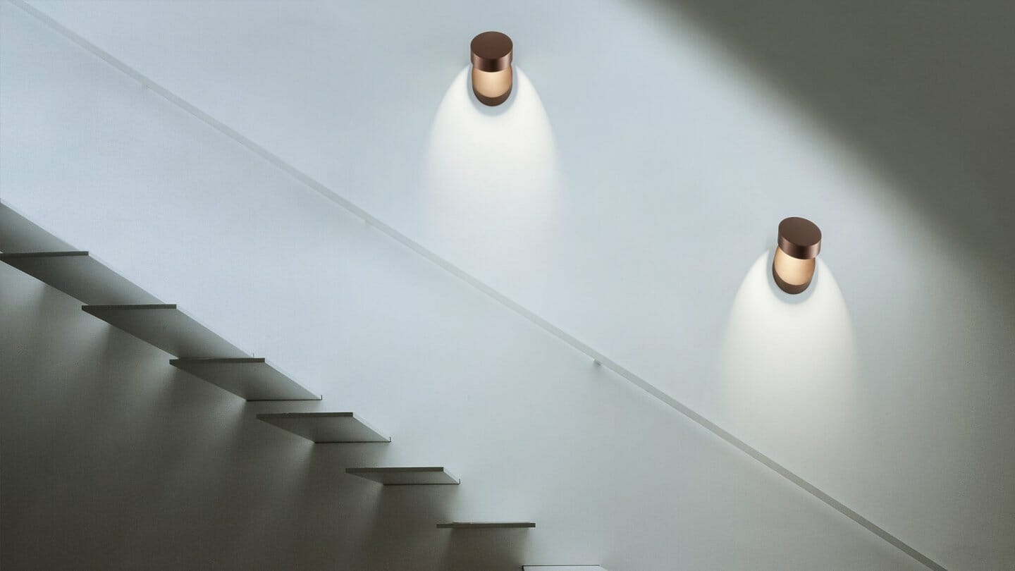
Architects use whole buildings to funnel light to create interesting shapes and patterns. We build to face the sun to avail of the most of the natural light, and with the abolishing of window tax (a tax they imposed a 100 years ago!) freely use large windows to optimise this. Once the sun goes down our need for light to carry on our day gives the opportunity to paint with light. You can wash your room with a bright blast of white light or just light your armchair with a low level table lamp. It all depends on what you need the light for, task, ambient or decorative. One of the brands we exclusively stock cleverly uses this light play to create interesting shapes on your walls. Studio Italia’s Thor by Andrea Tosetto lets you create a full moon or a total eclipse (not to mistaken with a Jaffa cake ad!). Pin-up is totally adjustable and lets you paint the light over the wall the way you feel. Shelf refracts the light up in an arc creating organic abstract shapes. A light is much more than a practical function it allows you to paint your walls creating a light art feature on your walls when otherwise it would be blank.

Caravaggio knew how to create a dramatic contrast of light bringing a blank canvas to life. You can do this with your space from the biggest expanse of a building to the smallest cubbyhole that you spend time in. Like a great master play around with the tools at your disposal. Look at your walls and rooms as blank canvasses that you want to accent and highlight. Play around with light strengths and fittings. Do your research and create a masterpiece of your own.
- Design
- Art, Creativity, Interior Design, Light Art, Light Brands, Light Design, Lighting Products, Studio Italia

About Willie Duggan
Willie grew up in the family business, stacking boxes, wiring fittings and making deliveries. He went on to study engineering and then lighting design. After working as a lighting designer in London he returned to lead our design team. You can also find Willie chasing a ball round the rugby pitch, at a gig or threading the boards on stage.
Browse by category
Browse by tag
- #IDSW2019
- 2019
- 2021
- 2022 Award Winners
- 48 volt track
- About Us
- Ambient Lighting
- Architect
- Art
- Arturo Alvarez
- Awards
- Bathrom
- Bathroom
- Bathroom Design
- Bathroom Lighting
- Baynetcap
- bedroom lighting
- Behind the Scenes
- Biophilia
- Biophilic Design
- Blanchardstown Shopping Centre
- Blog Post
- Blue
- Brands
- building materials
- bulbs
- Carton House
- church design
- Colour
- Comfort Lighting
- commercial
- commercial design
- Contract Interiors
- cost
- Cottage Design
- Creativity
- Deconstructing
- decorative lighting
- Denise O'Connor
- Design
- Design Team
- Details
- Dining Space Lighting
- Downlighting
- downlights
- E14
- electrician
- Electrics
- Emotion
- Emotional Lighting
- enviromentally friendly
- Estluz Laverd
- Exhibitions
- Experience
- experiential showroom
- Exterior Lighting
- external lighting
- eyelit65R
- Festoon Lighting
- Finalists
- Finances
- first fix
- five star hotel
- floor lamp
- Floor Light
- Floor Plan
- flooring
- functional lighting
- Garden
- Garden Lighting
- Getting the lighting right
- Glare
- GU10
- guide
- Haberdashery
- Hard Wood Flooring
- healthy lighting
- Heart of the home
- hidden lighting
- hints
- Home
- Home renovation
- house design
- Hypro
- Illuminated Furniture
- IMNDA
- importance of windows
- inchsawmills
- Interior Design
- Interior Lighting Design
- Interiors Trends
- International Dark Sky Week 2019
- internorm
- IP Rating
- Irish Times
- Ivela
- Jan Battles
- kitchen
- Kitchen Design
- Kitchen lighting
- Kitchen Squeeze
- Lampshades
- Landscape Lighting
- Layers of Light
- LED
- LEED
- Light
- light and health
- Light Art
- Light Brands
- Light Design
- Light Effects
- Light Fitting
- light masterplanning
- Light Pollution
- Light Technology
- lightbulbs
- Lighting
- Lighting Company
- lighting controls
- Lighting Design
- lighting designer
- Lighting Designers
- Lighting Plan
- Lighting Products
- lighting switches
- lighting tips
- LIT awards
- Living Space Lighting
- LND
- LZF
- Minimal Glare
- Monica Duggan
- mood lighting
- Motor Neurone Ireland
- munster joinery
- Nest
- new build
- New Year
- new york
- newbuild
- Newsletter
- night time lighting
- NYCxDESIGN
- Online Consultation
- Open Plan Space
- Our Team
- Outdoor
- Outdoor Lighting
- Parquet FLooring
- pendant light
- Pendants
- Piet Oudolf
- plastering
- plumbing
- Power of Switching
- Prolicht
- recessed lighting
- reducer
- reflections
- renovate
- Renovation
- Residential Lighting
- Residential lighting design
- retail
- Retro Fit
- riai
- salvaging
- scene setting
- Self build
- Self Build Newsletter
- selfbuild
- senator
- shadows
- sonos
- spacer
- Spotlights
- st bartholomews church
- Studio Italia
- sustainable
- sustainable building
- switching
- table lamp
- Table Light
- talalighting
- Task Lighting
- The Irish Times
- timber frame
- tips
- Trend
- tricks
- UGR
- Unified Glare Rating
- voliere
- willie duggan
- willieduggan
- Windows
- wiring


- Inspire
